Home > Tutorials > Creating a Graph
Creating a Graph sadfadfs
1. To create a KPI you first must choose a query and click next
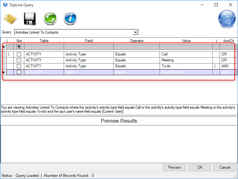
2. Next specify what type of Filters you want to run and what fields to search on. When done click the right arrow
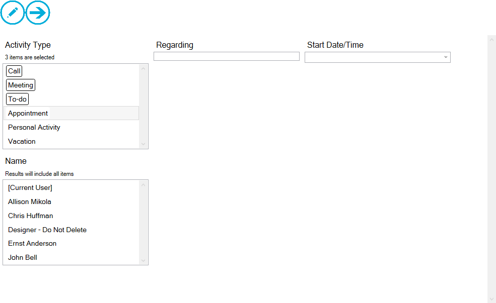
3. Next choose what field you would like to filter on..
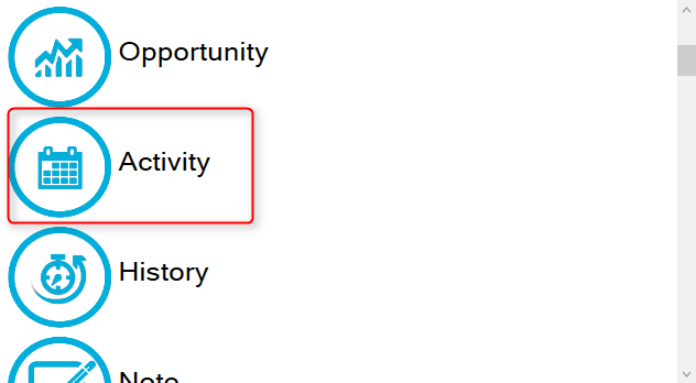
1. Table Field is in. Eg; Activity Type is in Activity Field
2. Field Name
3. Field Value 
6. Click the right arrow on the top right
7. The data is now display in a Simple Graph format.
*This is the default graph format which is always generated anytime a graph dashboard is created. After creation the user has the option to change to another graph format.*
-We show the instructions on how to do this after step 10 in this guide. 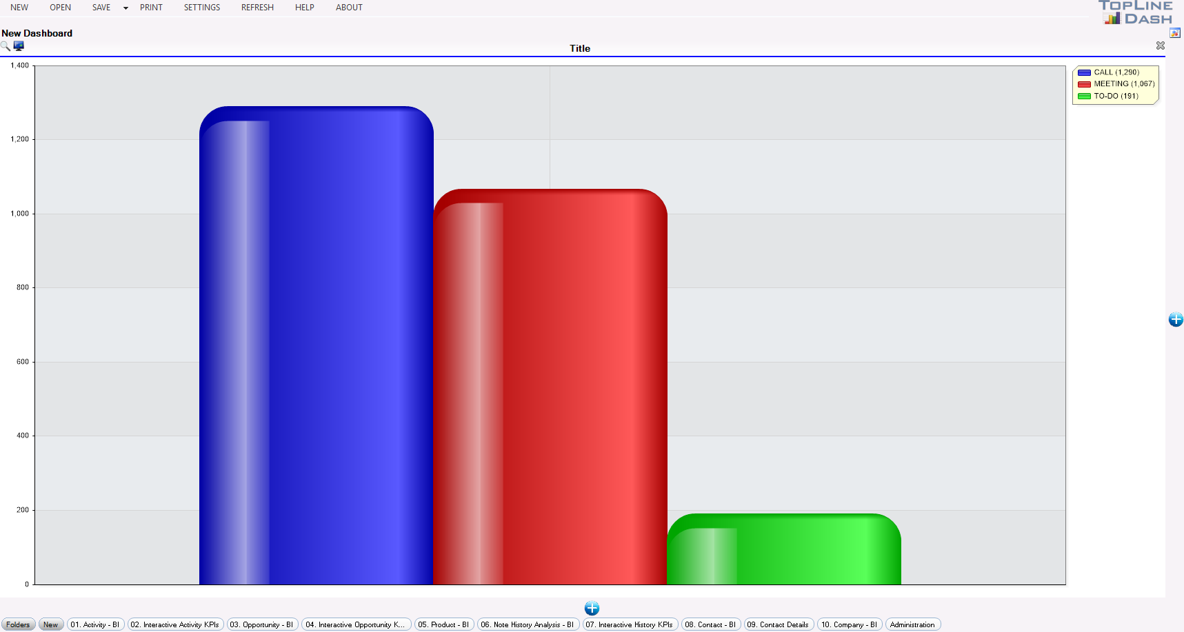
9. If you double click a record you can drill down see the details of each entry that was created. In this case I clicked on the meetings record. You will now see all open meeting activities for the [current user] 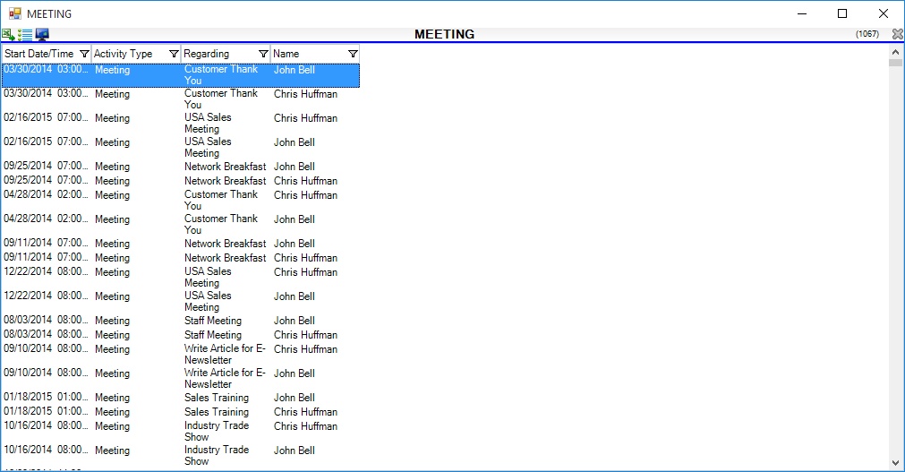 10. If you double click on one of the record meeting activities below you will be able to access the activity details  Creating different Graph Forms Creating different Graph Forms
1. If you want to change the graph format you will need to click on the screen icon in the dashboard toolbar 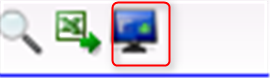 2. You will be presented with the screen below: 1. You can change the graph from a bar graph to a pie graph, line graph, or Funnel graph 2. You can change the field the graph is based on. You can also add a group field which will allow you to break the graph down even further. 3. If you change your mind about wanting a graph you can change your selection to a list or KPI instead. 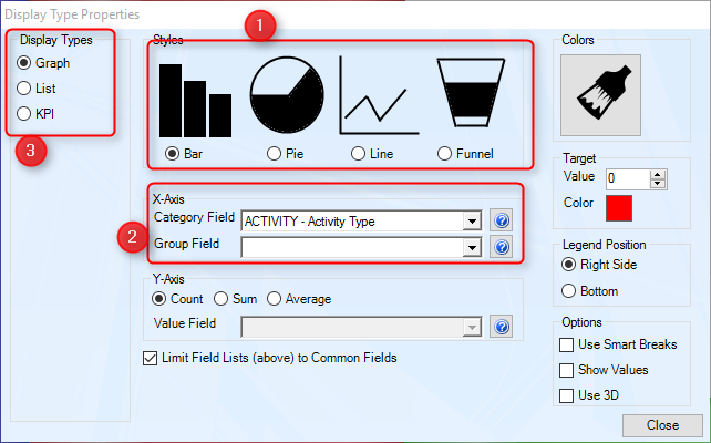 See also
|